Venture Skin
Designing the business website for Neu Media, a real estate photography and videography company.
Designing the business website for Neu Media, a real estate photography and videography company.
OVERVIEW
Venture Skin is an app where your skincare exploration is expertly guided by leading skin scientists and board-certified dermatologists.
Curated by some of the industry's most knowledgeable minds, the app seamlessly integrates scientific and dermatological expertise to deliver a customized analysis of your skincare routine and product recommendations aligned with your skincare goals. Each product suggestion is grounded in the latest scientific research and dermatological insights.
GATHERING CONTEXT
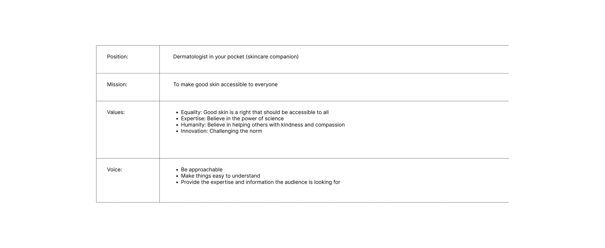
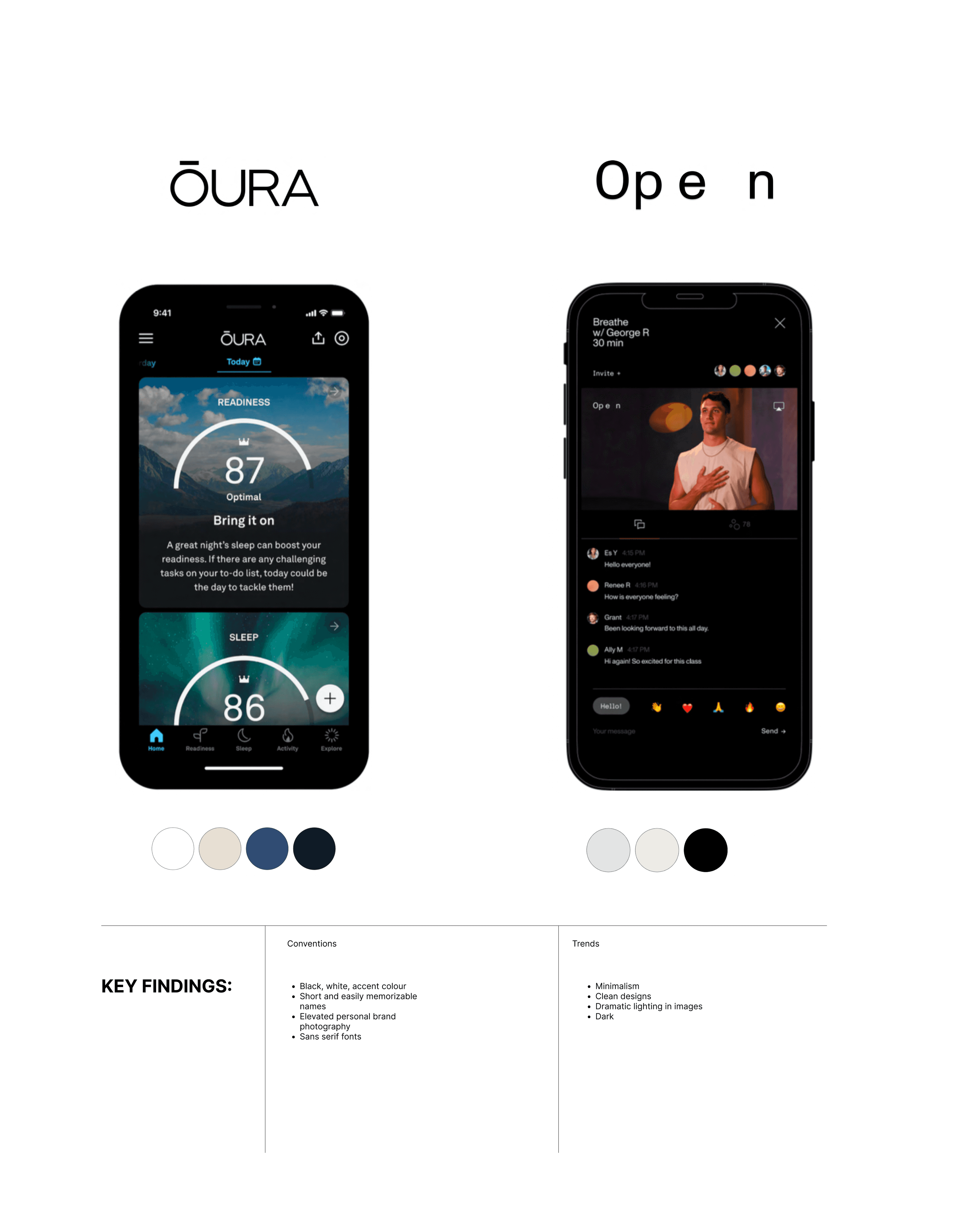
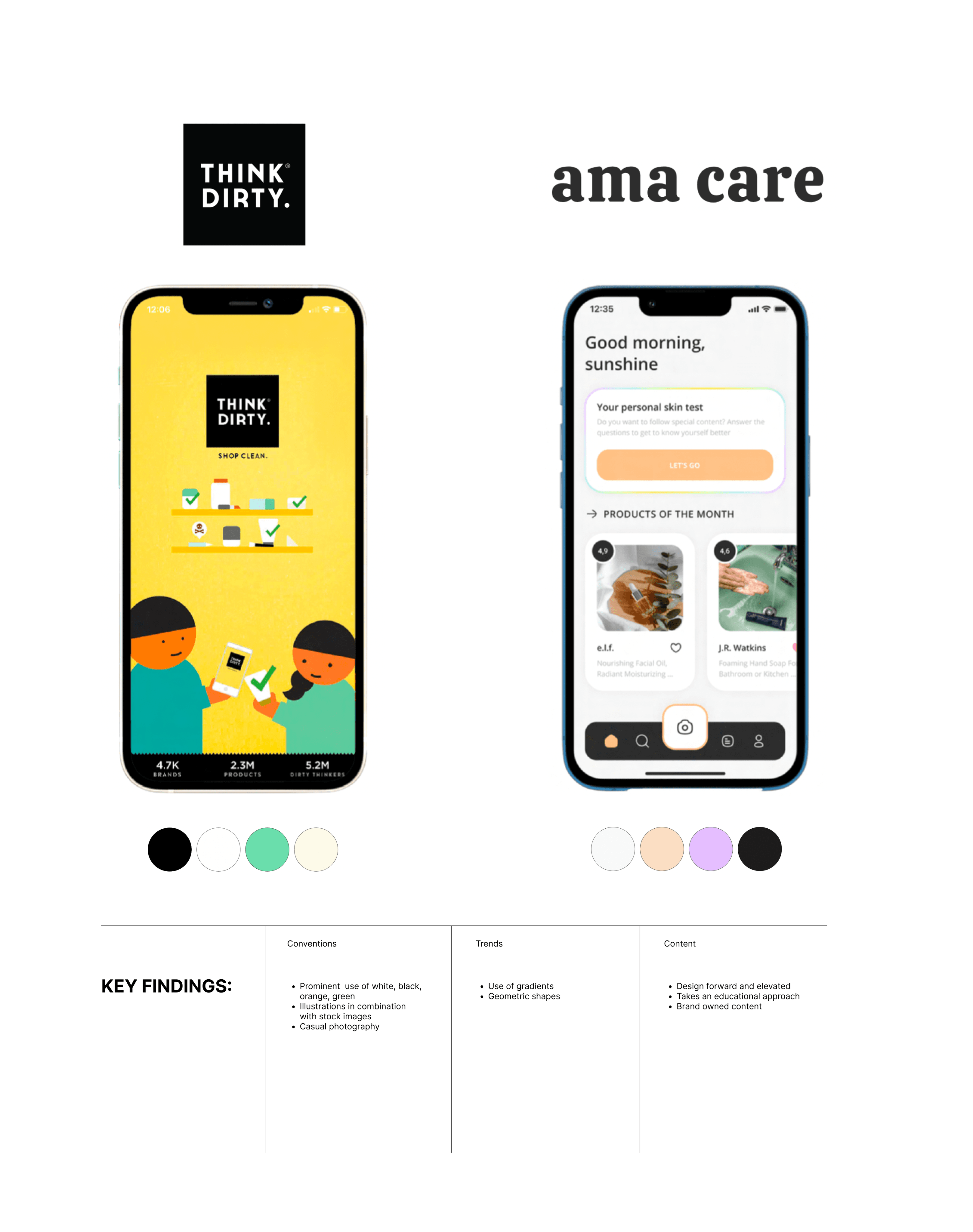
Before formulating our design strategy, we gathered information by holding a meeting with the client to gain insight into their product, target audience, design preferences, and any pre-existing company guidelines. After our initial meeting, we created a competitive analysis for competitors in a similar category to the product and came up with the brand direction.
Here, we compiled key findings that would in turn help us align our brand direction and our future design approach.
Note: client provided preliminary research. Research done below is supplementary to further understanding of the project.



SOLIDIFYING THE USER FLOW
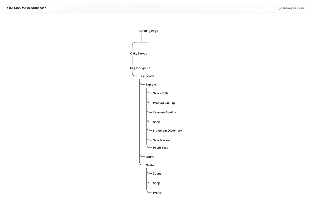
Prior to creating the initial wireframes, as a team we went over the client brief and our previous research, then created a site map to list out the potential screens that we may need to build out.
Prior to creating the initial wireframes, as a team we went over the client brief and our previous research, then created a site map to list out the potential screens that we may need to build out.

OUTCOME
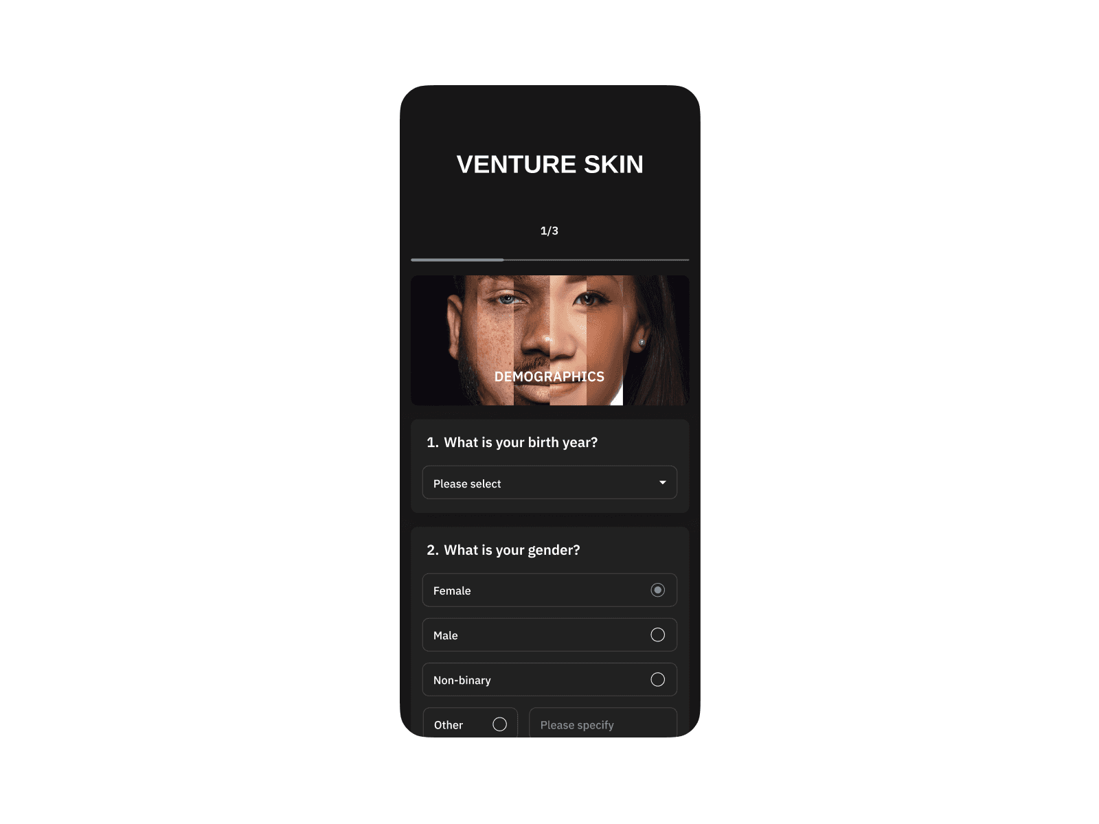
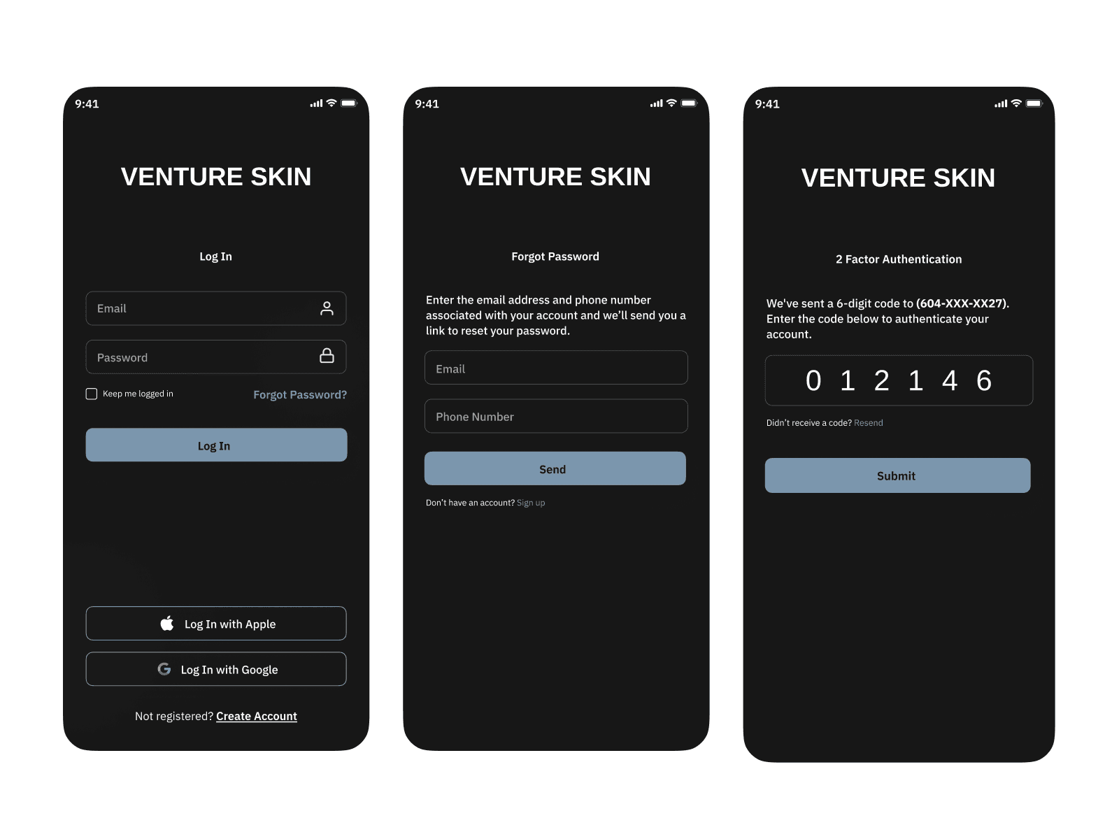
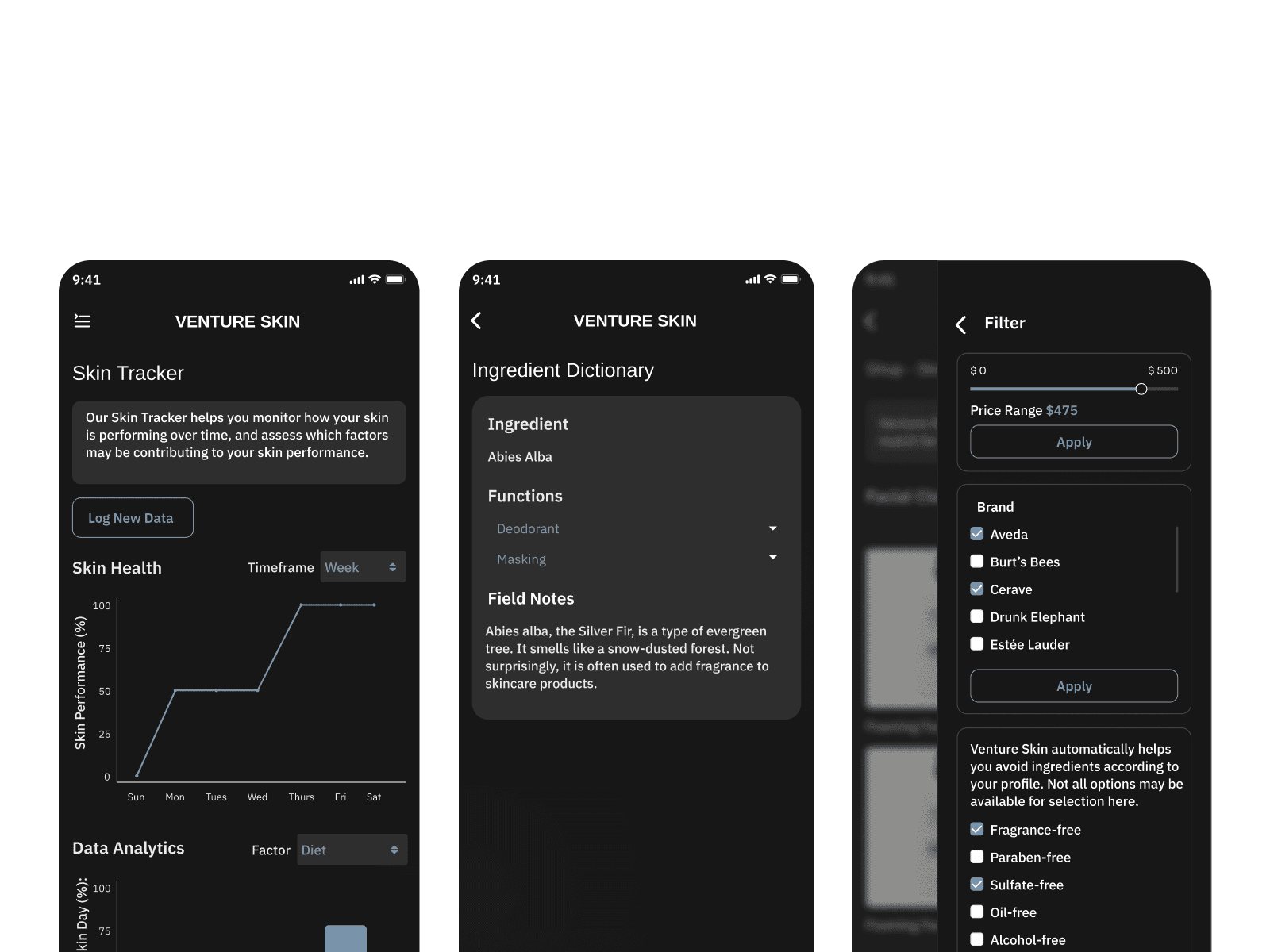
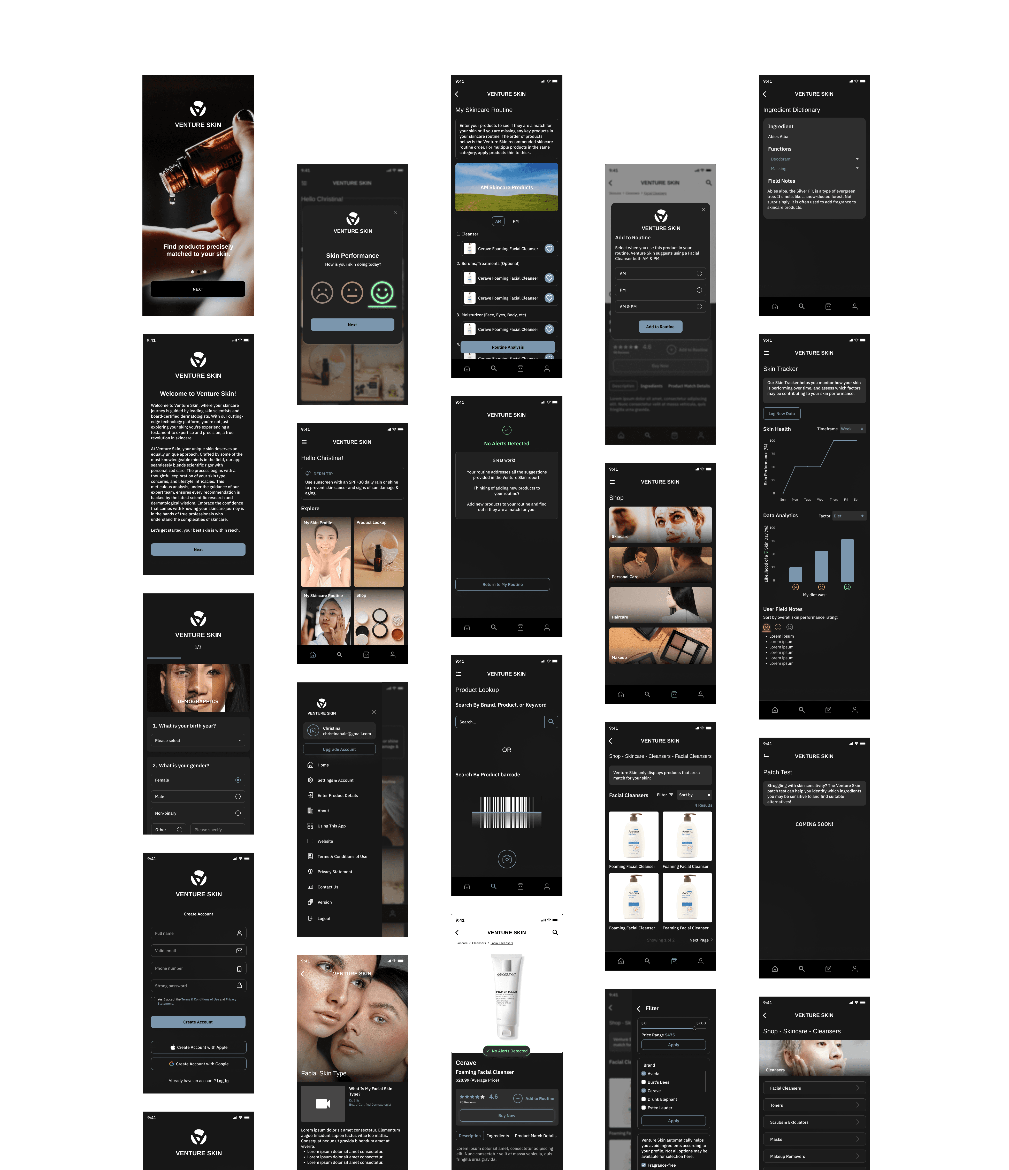
The final result was a clean, dark mode application with a commerce section, personalized routines, skin testing, and more! It is currently in the process of being launched.
Edit: It is now live on the app store!
The final result was a clean, dark mode application with a commerce section, personalized routines, skin testing, and more! It is currently in the process of being launched.
Edit: It is now live on the app store!

