MoneySwift
Helping the MoneySwift team design their cloud-based international payment app.
Helping the MoneySwift team design their cloud-based international payment app.
ROLE
UI/UX DESIGN
CLIENT COMMUNICATION
TIMELINE
JUL 23 -> SEP 23
OVERVIEW
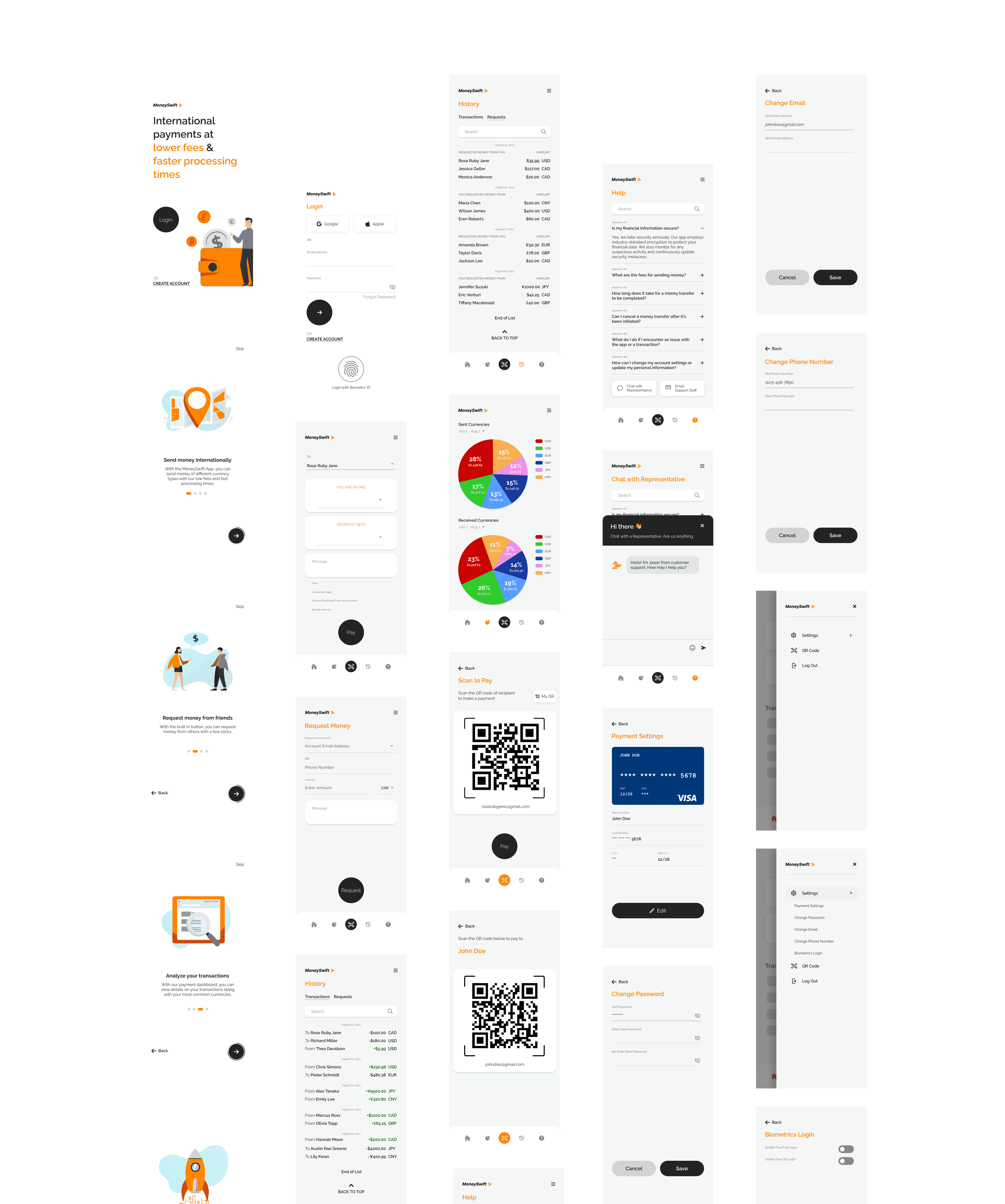
MoneySwift, a client project, offers a cloud-based solution for international payments, delivering a swift, dependable, and efficient fund transfer experience worldwide. With MoneySwift, customers can seamlessly send and receive payments in various currencies, benefitting from rapid processing and cost-effective transaction fees.
The platform also facilitates peer-to-peer transactions, enhancing the efficiency, affordability, and security of fund transfers. This service empowers users to send payments directly to recipients globally and locally, eliminating the necessity for a middle man in the transaction process.
LAYING IT ALL OUT
Upon analyzing the client's brief and requirements, our central focus shifted to determining the essential screens to integrate into the application. This process involved constructing a site map to visually organize our concepts, followed by the creating of the initial wireframes for the application.
Note: client provided preliminary research. Research done below is supplementary to further understanding of the project.

ITERATE, ITERATE, ITERATE
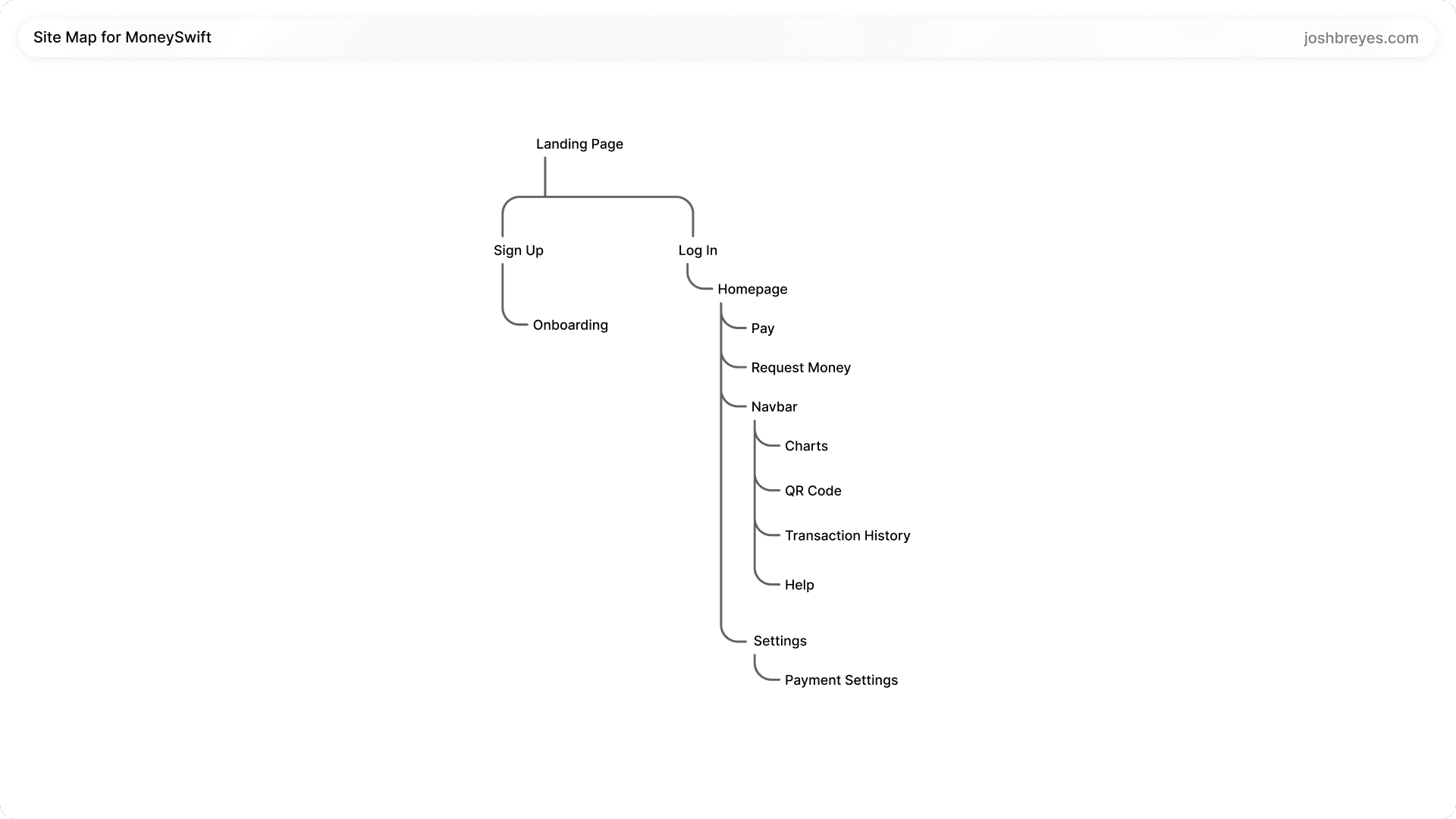
Prior to creating the initial wireframes, as a team we went over the client brief and our previous research, then created a site map to list out the potential screens that we may need to build out.
Prior to creating the initial wireframes, as a team we went over the client brief and our previous research, then created a site map to list out the potential screens that we may need to build out.

WHAT DO USERS THINK?
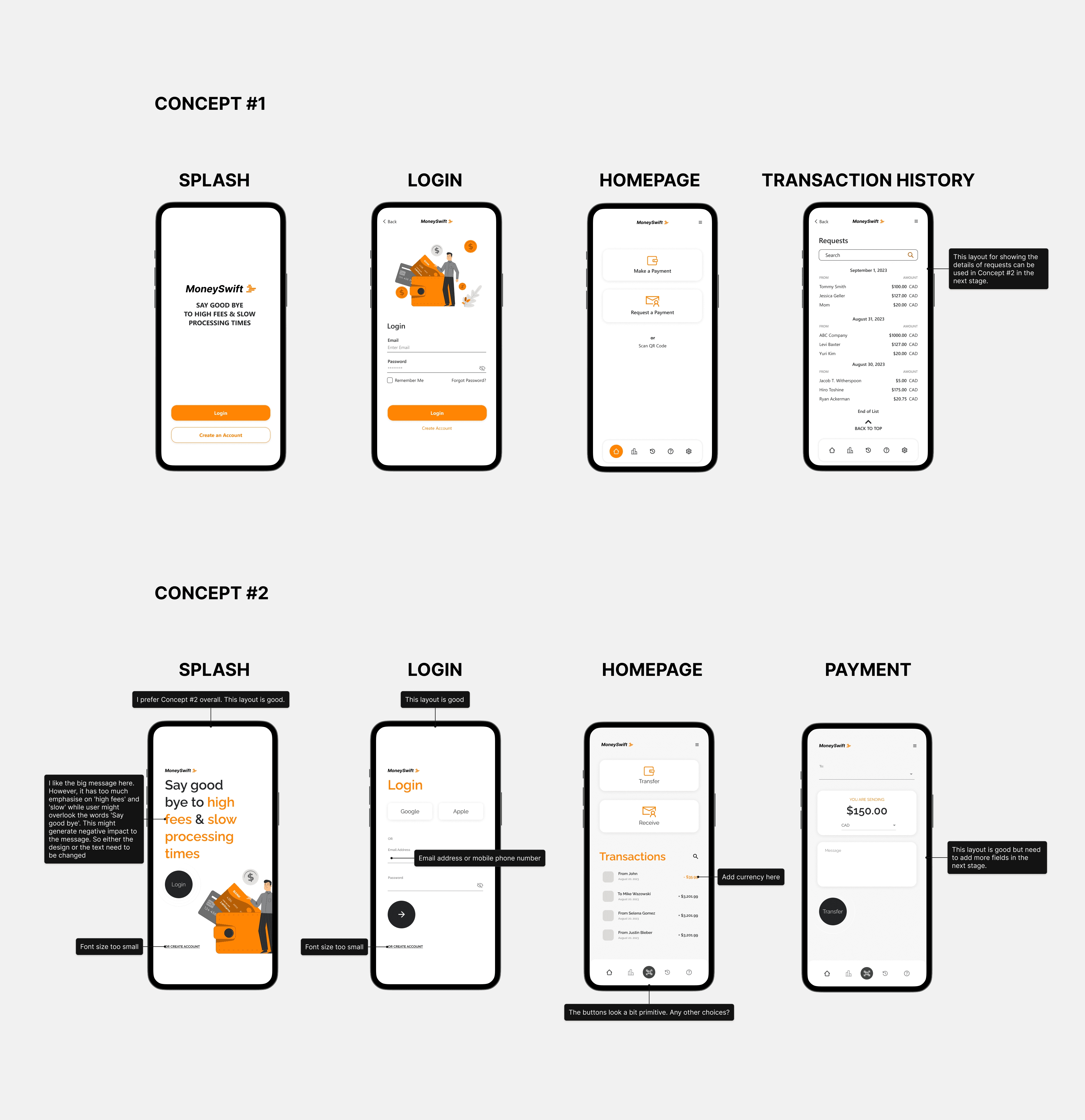
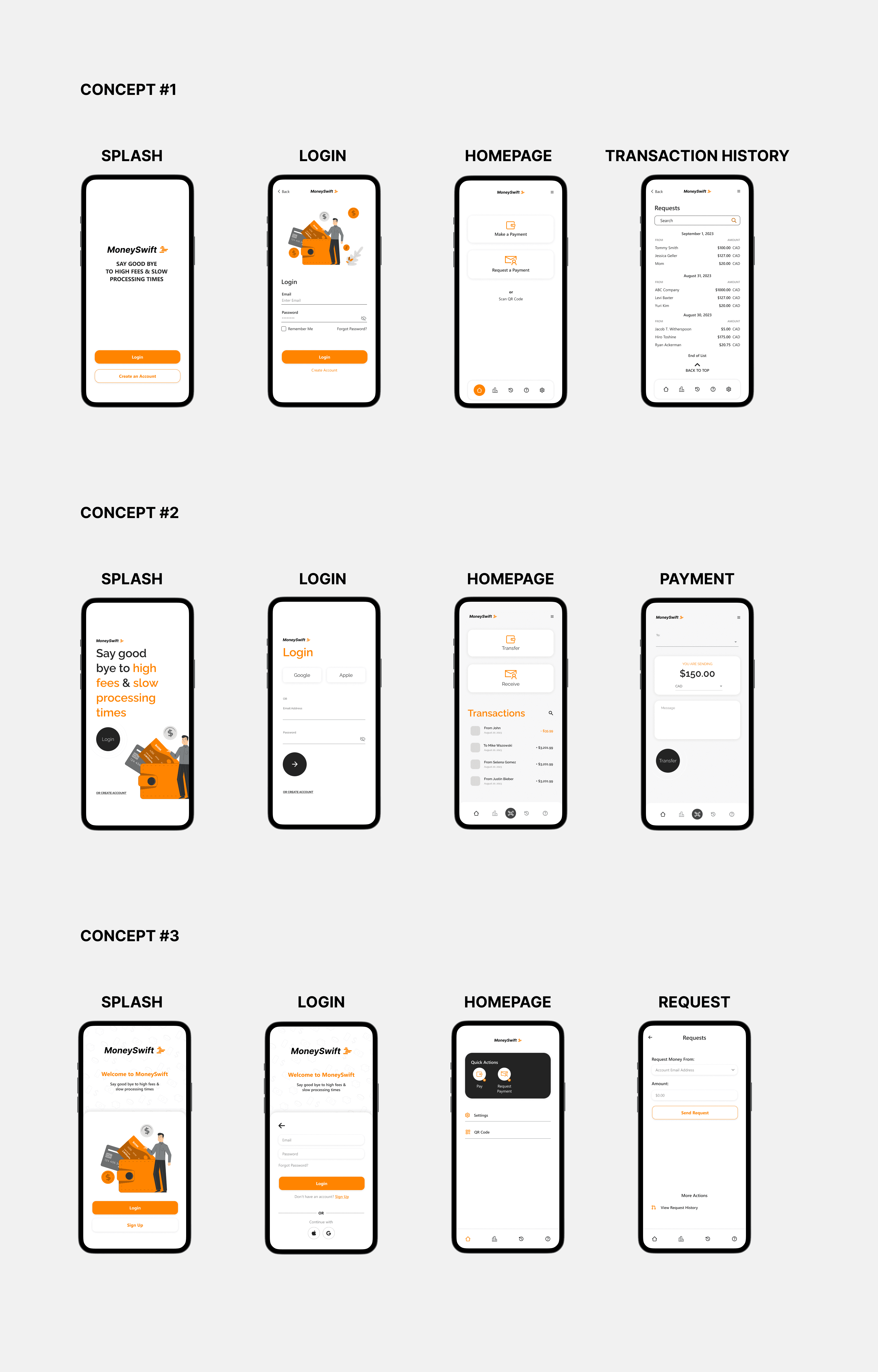
After creating the medium-fidelity design concepts, we initiated user testing to gain precise insights into aspects of the design causing user frustration and needed further refinement. We annotated what users said onto the screens.
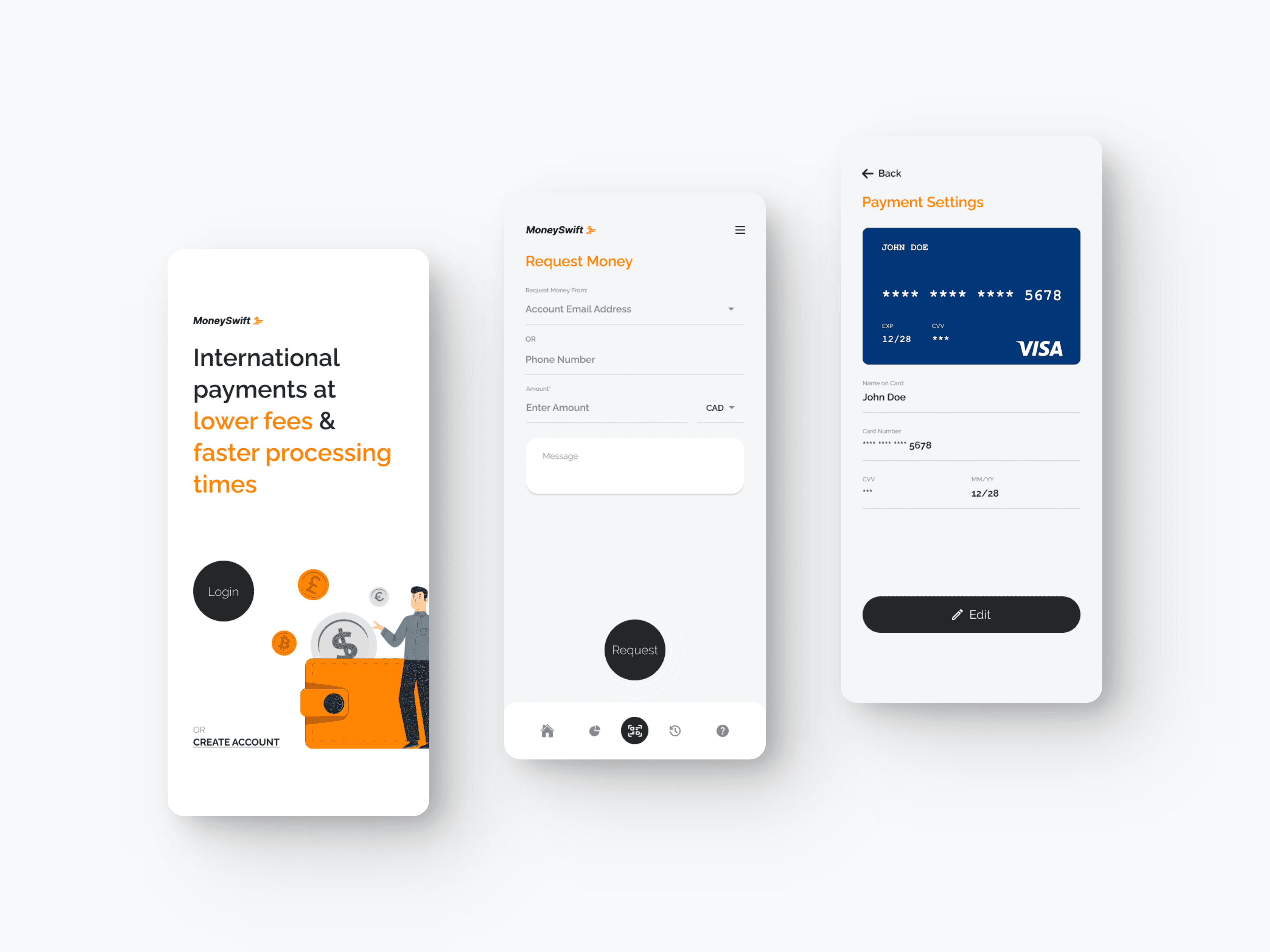
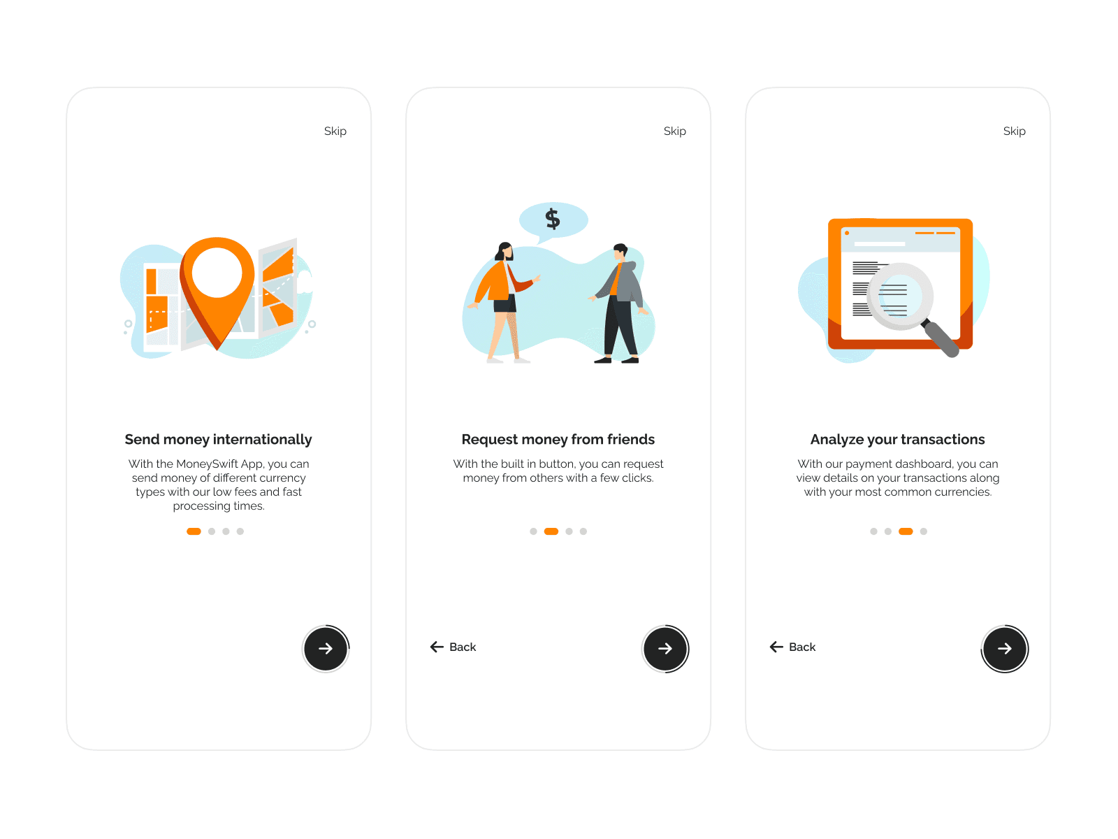
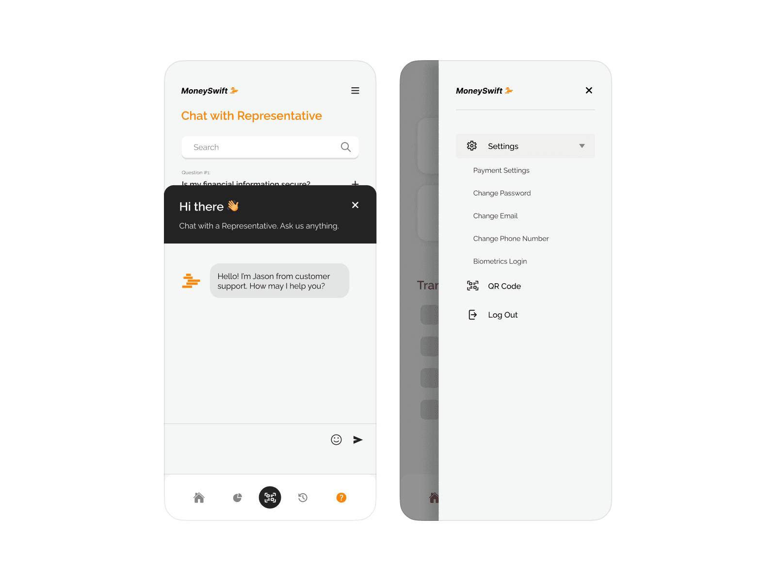
Through careful analysis of user feedback, we implemented design adjustments to improve the overall user experience. Then, we proceeded to develop the remainder of the application with this valuable feedback as our guiding principle.
